12.22.2017
Concerning raw files for those who don't understand the purpose and differences:
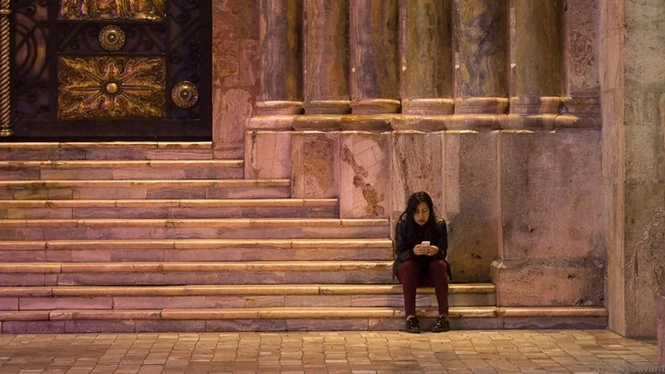
1. Sony Raw file imported into Lightroom into Adobe colorspace (purposely underexposed when shot). The image looks dull and lifeless. This is not how the scene looked in real life, but the data is there in highlights and shadows for processing, rather than 2/3 of the data being tossed out if it were a jpg:
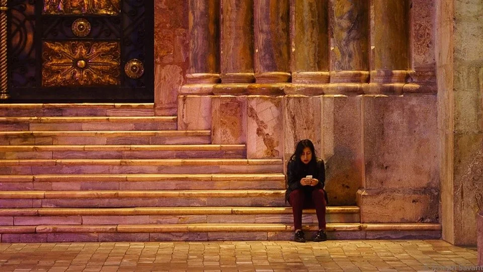
2. Sony Camera JPG Profile with "Landscape"profile applied in Lightroom (identical to what a JPG from camera would look like - not bad but a little underexposed)
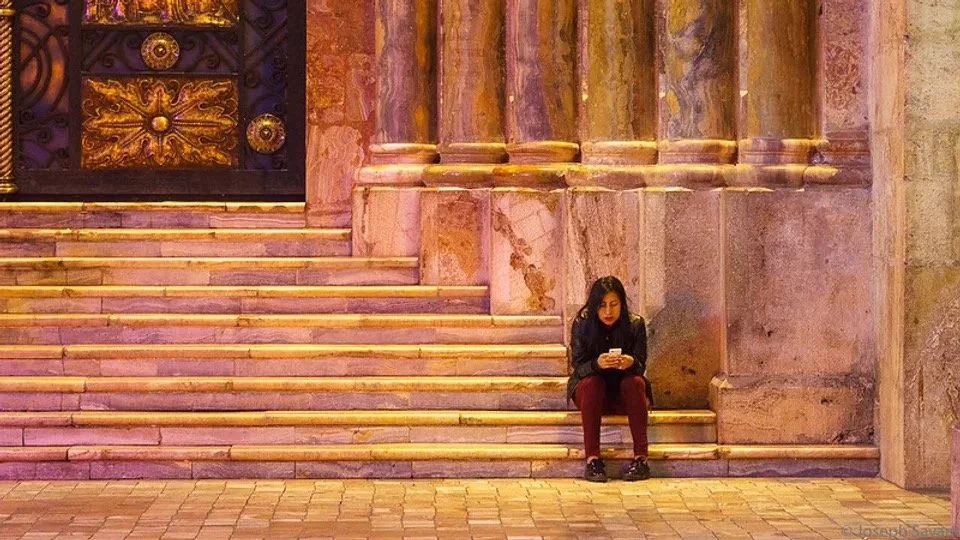
3. Sony Raw file with correct white and black point set, and exposure correction - much more detail and subtle color.
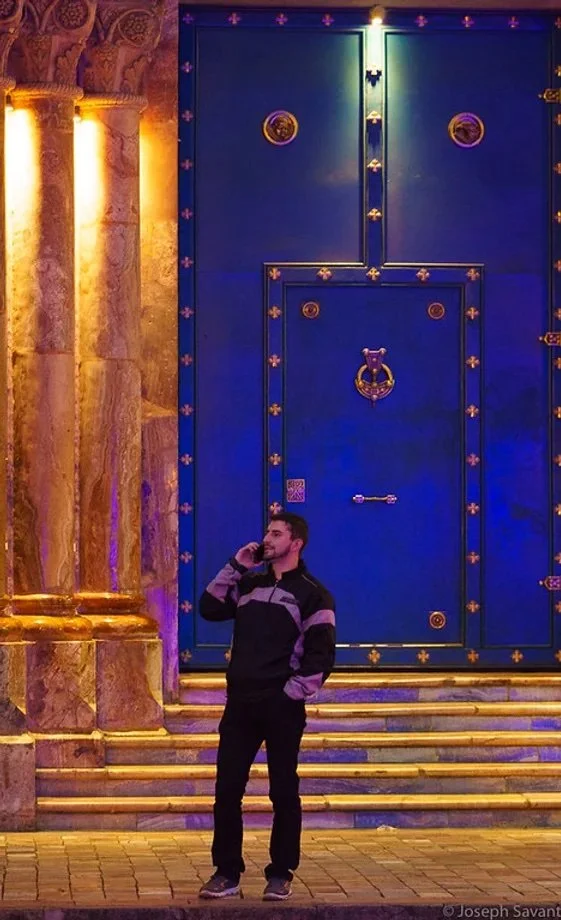
This next image looks like heavy handed manipulation but it's not. The heavy blue on the door looks oversaturated, but it's actually the reflection of a massive, blue LED Cuenca sign across the street. The yellows are the overhead lights and the pinkish hues are from the mix of blue light and overhead orange sodium vapor lights in the park, as well as the red taillights of the line of cars in front of the guy. The magenta saturated streaks on the columns are the blue LED's reflecting into the glossy gold marble, the gold eliminating enough blue to leave the magenta base. The same blue reflects as blue on the white marble between the steps, because the white marble doesn't kill the blue as does the gold on the columns. It appears to those who know nothing about light or color as an oversaturated magenta, but that's how color and light work. That's how the moment looked and the reason I shot it.
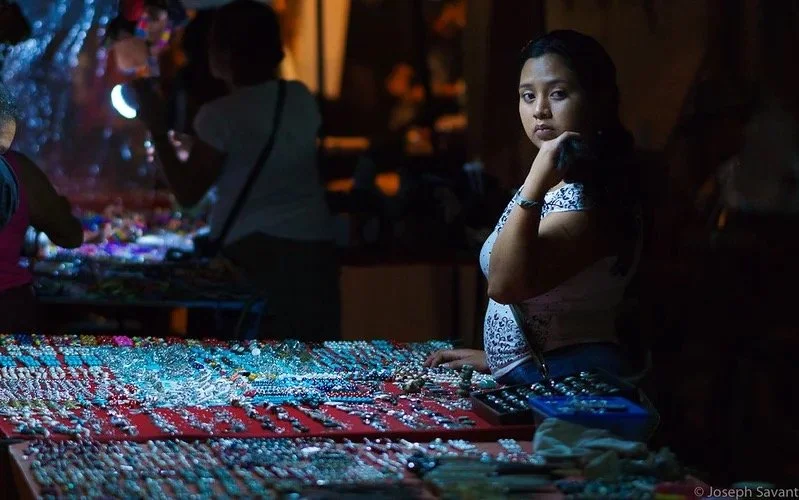
Thefollowing image from Honduras was shot with only the light of an LED lamp. I loved the dull color it made, capturing the late night boredom of the vendor. It was processed exactly the same as the above images with the same settings, but inherent in it's nature were the flat colorations, not brilliant ones.
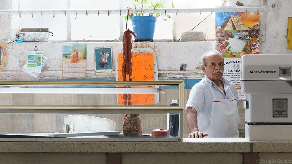
The next image was processed from the raw file with the same settings the other images have, the difference being the muted subject matter and inherent flare from the windows that muted the colors and shadows into a soft and subtle image.
Point is, don't confuse subject matter, light, environment, atmospheric conditions, lens renderings (which differ substantially between each lens you own), and all the other variables, with having been manipulated one way or another. All of my images are imported with the same corrections and generally are exported out as jpg's with no changes. To that matter, jpg's toss most of the data and change from your original on export. They then enter the world of differing color monitors and computers. Your computer and monitor may display that jpg very differently than your spouse’s iPad.
Entering a world of insane variables in image processing and display will lead you down a never-ending road chasing your tail. I suggest just enjoying taking photos and don't sweat bullets unless your'e trying to copy the Mona Lisa for a museum and need to be as accurate as possible. But then again, that ain't really photography, it's technical recording.
The following image of yours truly is a good example of JPG limitations. Charlie's Olympus produced typical jpeg output which is both dull and oversaturated at the same time, with no detail in the clouds or black shadows. Don't forget, when you see an image, your eye doesn't see black shadows or overexposed clouds. It compensates instantly and sees detail in shadows and detail in clouds. This image doesn't look anything like what Charlie saw at the time. Raw files will allow you to make the image look closer to what was reality, if you know what you're doing. If a raw file was available, when processed it would render much more shadow detail and also detail in the clouds.
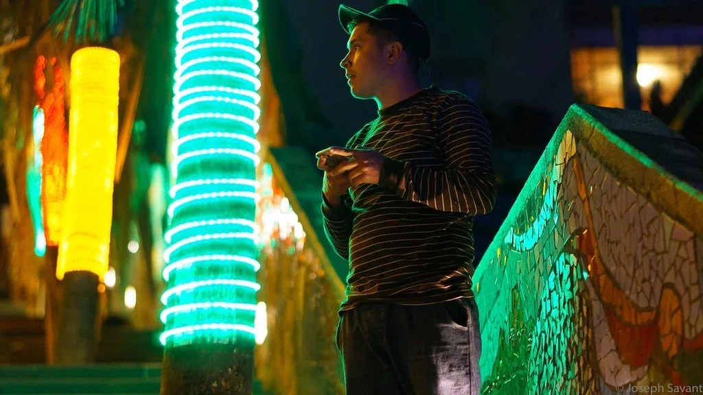
Caught the following when Michnus, Elsebie and I were walking around the other night, specifically for the brilliant surreal colors! I knew how to expose for the midpoint, blowing the colored light strings into saturated glows to capture the tone of green I wanted on the tiles and his profile. It's not manipulation, it's understanding how to shoot.
I hope this helps some of you guys begin to look at things differently and to understand the value of raw AND the camera system you choose. Some are better than others. Canon has always had flat color but good skin tones, Sony is good in low light and good with color, but I feel Fuji has the best combination of all. No camera brand has completely accurate colors, even when calibrated with custom profiles, and will always interpret colors differently than another.
If you want to become a photographer, look for images you like and capture moments in life that engage people, focusing on why rather than the technical issues. If you're happy with jpg's that's great. If you want to improve the quality then consider diving into the world of raw. The point and purpose of photography is to create images that are beautiful and capture the viewer. Get the basics of technique down and then move on to what's important - the image you capture that captures others. Ignore the photo forums that rant on about megapixels and technical details.
Choose life and color instead!